Grid layout
Renders content on a two-dimensional grid layout.
Node name : grid-layout
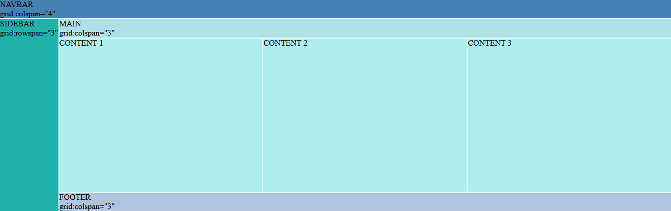
Introduction
Horizontal and vertical layout are mostly intended for one-dimensional layouts.
If you need a two-dimensional layout approach you can use a grid layout component.
The first step is to create a grid definition which set columns and rows behavior.
Note
If no grid definition is set, the grid layout will act in the same way as a vertical-layout (only one column and each element displayed on its own row).
The next step is to create a grid content containing the nodes you want to render inside the grid cells. Each node will render inside the next available cell, starting by the top left of the grid, then spreading by rows then by column to end with the bottom right cell of the grid.
It's also possible to make a node span across multiple rows or columns with the associated directives (grid:colspan & grid:rowspan)
Finally, the grid layout definition and nodes span can be adjusted for different screen sizes and make it responsive.
<grid-layout>
  <grid-layout-definition>
      <grid-layout-rows>
          <grid-layout-row height="auto" />
          <grid-layout-row height="auto"/>
          <grid-layout-row height="auto"/>
      </grid-layout-rows>
      <grid-layout-columns>
          <grid-layout-column width="auto"/>
          <grid-layout-column width="auto"/>
          <grid-layout-column width="auto"/>
      </grid-layout-columns>
  </grid-layout-definition>
  <grid-layout-content>
      <card grid:colspan="2">
          <text>Card 1</text>
      </card>
      <card>
          <text>Card 2</text>
      </card>
      <card>
          <text>Card 3</text>
      </card>
      <card grid:rowspan="2" grid:colspan="2">
          <text>Card 4</text>
      </card>
      <card>
          <text>Card 5</text>
      </card>
  </grid-layout-content>
</grid-layout>
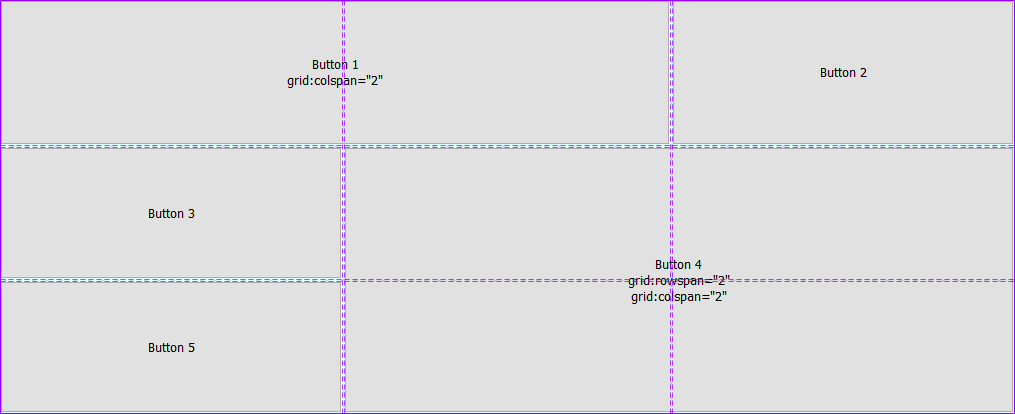
In this example, a grid with 3 rows and 3 columns is created. Each column/row has an auto size which means that each cell of a row/column will take as much space as its siblings.
Card 1 has a grid:colspan attribute set to 2 which means that the cells rendered will take the width of two columns.
Card 4 has the same grid:colspan and grid:rowspan value set to 2. It means that it will be rendered on a 2x2 sized cell.
The others cards take the space of the next available cell. After Card 4 takes it's space, the next available cell is on third row, first column. That is where Card 5 is rendered.
Warning
Directives can't be used on grid-layout-definition (and its children nodes) or grid-layout-content nodes because these tags are only used to configure the grid layout.
Grid definition
Node name : grid-layout-definition
The grid layout definition have to be put inside a grid-layout-definition node :
<grid-layout-definition gap="large">
      <grid-layout-rows>
        <!-- rows definition -->
      </grid-layout-rows>
      <grid-layout-columns>
        <!-- columns definition -->
      </grid-layout-columns>
  </grid-layout-definition>
You can also specify a gap size between each cell of the grid with the optional attribute gap.
Values : none (default), small, medium, large, extralarge
Rows
Node name : grid-layout-row
For each row of the grid, the grid-layout-rows node has to contain a grid-layout-row node with an height attribute set to one of the following values :
| Value | Effect |
|---|---|
n |
Fixed height of n pixels. n is an integer. |
n% |
Fixed height of n percent of the grid layout's total height. n is an integer. |
fit |
Adapts the height to the content of the row. The row height matches the height of the tallest element it contains. |
* or n* |
All rows using a height of * or n* share the grid-layout height left free by rows with a fixed height. If a row has a height of 3*, it will take 3 times the height of a row with a height of *. If two rows have have the same value, for example 3*, they have the same height. n is an integer. |
auto (default) |
The behavior depends on the presence of other rows with a height that can fill the height left free by rows with a fixed height. When no rows can fill empty space, auto makes the row height fill the empty space (same behavior as *). When other rows can fill empty space, auto makes the row height fit the tallest element it container (same behavior as fit). |
<grid-layout-definition>
      <grid-layout-rows>
        <grid-layout-row height="*" />
        <grid-layout-row />
      </grid-layout-rows>
      <grid-layout-columns>
        <!-- columns definition -->
      </grid-layout-columns>
  </grid-layout-definition>
In this example, the first row of the grid will take the available height of the grid. The second row will take as much height as its tallest cell.
Columns
Node name : grid-layout-column
For each column of the grid, the grid-layout-columns node has to contain a grid-layout-column node with an width attribute set to one of the following values :
| Value | Effect |
|---|---|
n |
Fixed width of n pixels. n is an integer. |
n% |
Fixed width of n percent of the grid layout's total width. n is an integer. |
fit |
Adapts the width to the content of the column. The column width matches the width of the widest element it contains. |
* (default) or n* |
All columns using a width of * or n* share the grid-layout width left free by columns with a fixed size. If a column has a width of 3*, it will take 3 times the width of a column with a width of *. If two columns have the same value, for example 3*, they have the same width. n is an integer. |
auto |
The behavior depends on the presence of other columns with a width that can fill the width left free by columns with a fixed width. When no columns can fill empty space, auto makes the column width fill the empty space (same behavior as *). When other columns can fill empty space, auto makes the column width fit the widest element it container (same behavior as fit). |
<grid-layout-definition>
      <grid-layout-rows>
        <!-- rows definition -->
      </grid-layout-rows>
      <grid-layout-columns>
        <grid-layout-column width="*" />
        <grid-layout-column width="*" />
        <grid-layout-column width="*" />
      </grid-layout-columns>
  </grid-layout-definition>
In this example, each column of the grid will adjust their width to share the available space equitably.
Note
The width attribute can be omitted in this example because * is the default value.
Auto-generated rows
If you don't know how many rows will be needed to render the nodes (for example when using a repeater on a datasource), you can define an automatic row height within the grid-layout-rows node.
This parameter is taken into account only for the rows created after the potentially defined rows.
<grid-layout>
  <grid-layout-definition>
      <grid-layout-rows auto-height="*">
          <grid-layout-row height="50" />
      </grid-layout-rows>
      <grid-layout-columns>
          <grid-layout-column width="auto" />
          <grid-layout-column width="auto" />
      </grid-layout-columns>
  </grid-layout-definition>
  <grid-layout-content>
      <heading grid:colspan="2">Heading</heading>
      <repeat values="collection">
          <text>$Item</text>
      </repeat>
      <!--
      ... It will render :
      <text>CONTENT 1</text>
      <text>CONTENT 2</text>
      <text>CONTENT 3</text>
      <text>CONTENT 4</text>
      <text>CONTENT 5</text>
      -->
  </grid-layout-content>
</grid-layout>
In this example, the first row will render the heading node on a full width row with a 50px height.
For the next nodes, created by a repeater, each node will use a new cell on a row with height adjusted to its content (as defined by the auto-height="*" attribute).
Nodes span
By default, each node will render inside the next available cell of the grid.
If you want to span a node across several rows and/or columns, you can use grid:rowspan and grid:colspan directives with a positive integer value.
<grid-layout>
  <grid-layout-definition>
      <!-- grid layout definition -->
  </grid-layout-definition>
  <grid-layout-content>
      <card grid:rowspan="4" grid:colspan="2">
          <text>Card</text>
      </card>
  </grid-layout-content>
</grid-layout>
In this example, the card will use the next available cells to fill a 4 cells high and 2 cells wide space.
Responsive grid layout
The responsiveness of the grid layout works with the use of breakpoints.
The idea is to first define a grid layout for the smallest screen (eg: mobile), then to override definitions when a larger screen need another layout configuration.

Breakpoints
To differentiate the different devices, we use the following breakpoints :
| Breakpoint name | Devices |
|---|---|
| (default) | Mobile devices |
small |
iPads, Tablets |
medium |
Small screens, laptops |
large |
Desktops, large screens |
extralarge |
Extra large screens, TV |
Grid definition
In order to define a specific grid definition in addition to the default one, we can use a grid-layout-definition node with the attribute device set to the corresponding breakpoint.
<grid-layout>
  <!-- Default grid layout definition (mobile) -->
  <grid-layout-definition>
      <grid-layout-columns>
          <grid-layout-column width="auto" />
      </grid-layout-columns>
      <grid-layout-rows auto-height="*" />
  </grid-layout-definition>
  <!-- Large grid layout definition (for Desktop) -->
  <grid-layout-definition device="large" >
      <grid-layout-columns>
          <grid-layout-column width="*" />
          <grid-layout-column width="*" />
          <grid-layout-column width="*" />
      </grid-layout-columns>
      <grid-layout-rows auto-height="*" />
  </grid-layout-definition>
  <grid-layout-content>
      <!-- Layout content -->
  </grid-layout-content>
</grid-layout>
In this example, the grid will have one single column adjusted to its content for devices smaller than a desktop. Then if the screen size is larger, the grid will have tree equally sized columns.
Column / Row span
To define responsive behavior for the row and column span, you can use the breakpoint name as a suffix.
<grid-layout>
  <grid-layout-definition>
      <!-- grid layout definition -->
  </grid-layout-definition>
  <grid-layout-content>
      <card grid:rowspan="4" grid:rowspan-medium="2" grid:rowspan-extralarge="1">
          <text>Card</text>
      </card>
  </grid-layout-content>
</grid-layout>
In this example, the card will take 4 rows height for devices smaller than laptop, then 2 rows for devices smaller than large screen, then only one row.
The same principle applies to the colspan directive.